Get in touch
Turning complex mobility benefits into a simpler experience

As part of our early-year goal to sign new clients and grow our user base, interviews revealed a critical issue: users didn't understand how or where to spend the budget available to them. French legal terms like "Forfait mobilités durables" meant nothing to them.
They couldn't translate them into concrete benefits, and simply loading €50 onto their Rout'in card wasn't enough. We focused the product team's work on two axes: helping users understand what they can do with their budget, and guiding them to actually do it.
Helping HR and employees fund their mobility

Born from a partnership between RATP and TotalEnergies, Rout'in's mission is to turn mobility into a meaningful employee benefit. The platform helps HR teams and employees manage and fund their daily commutes through a dedicated app and card.
Aligning 4 teams around 1 shared goal

We kicked off with a series of prioritization workshops bringing together Product, Tech, Operations, and Business to align around a shared goal.

Using a MoSCoW framework, we identified what was essential for v3 and what could wait for v4, keeping the scope realistic without losing sight of the long-term product vision.
Turning legal jargon into 3 actionable focus areas
From there, we formalized needs as User Stories in a Goal-Oriented Roadmap, written collaboratively across teams to cover every moment of the user and client journey, including pre-sales.
"As Rout'in, I want to send a habits survey to a company's employees ahead of time, to demonstrate our mobility expertise to the prospect."
"As an HR manager, I want to receive a personalized recommendation based on employee results, to understand the value of mobility benefits."
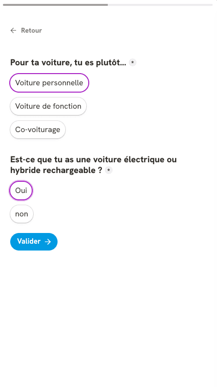
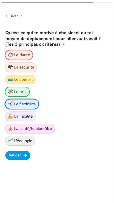
This is where the idea emerged: providing each new client with a onboarding survey for their employees, collecting mobility habits and generating a personalized mobility profile.

The workshops produced 3 focus areas for v3 sprints: "Collect my commuting habits", "Understand my benefits", and "Get personalized recommendations".
Mapping 27+ use cases to make eligibility crystal clear

One of the most structural pieces of work was building a matrix crossing possible use cases (e.g. repairing a bike), legal frameworks (e.g. EV charging funding), and user profiles (e.g. I drive a car). Built collaboratively between Product and Operations, it mapped 27+ combinations, situations like "I have a bike" or "I have a bike and take public transit", and linked them to the relevant legal schemes.

This tool let us determine precisely who was eligible for what, and more importantly, translate complex regulations into clear, actionable use cases: Buy a transit ticket, Pay for fuel, Fix my scooter.
A pre-onboarding survey to know users before they even log in
In parallel, my colleague and I built a no-code Tally survey for new employees and tested it with participants to validate our assumptions. The response was positive, people appreciated the idea of their employer working with Rout'in to understand their commuting habits before setting up their benefits.

Borrowing from Spotify Wrapped to make onboarding feel like a reward


With the Brand Strategy Consultant, we also redesigned the first-connection onboarding. Rather than a standard walkthrough, we drew inspiration from year-in-review formats like Spotify Wrapped, Apple Music Recap, and Duolingo, formats users already know and enjoy, which make information feel engaging rather than instructional.

Presented as a mobility personality test result, the onboarding surfaced profiles like "You're an occasional cyclist!" and immediately connected them to concrete use cases: insure your bike, get rewarded for your commutes, buy new gear.
Restructuring the app from 1 overloaded screen to a 3-tab navigation
My role then shifted to creating low-fidelity wireframes for the rest of the experience, including a full restructure of the app's navigation. The previous version had concentrated everything on the homepage. By moving to a cleaner 3-tab structure, I redistributed content so it appeared in the right context with use cases surfaced front and center on the home screen, directly below the account balance.

2 rounds of user testing to close the "I get it, but how?" gap
Finally, we ran a full round of user testing end-to-end, from the Tally survey through the story-based onboarding and profile consultation. Feedback led to adjustments mostly around wording and UI clarity, particularly around guiding users when selecting a use case. Tests confirmed users now understood what they could spend their budget on, though some still struggled with how to do it.
We iterated on each use case flow to build clearer, more guided tunnels, which performed significantly better in follow-up testing.

Challenges & results
Replacing legal jargon with actions people understand
Rout'in's core challenge was delivering an experience that feels as simple as products like Swile, while dealing with far greater underlying complexity than meal vouchers.
Behind a legal concept like "Forfait mobilités durables" sit dozens of possible use cases that are rarely obvious to users. Removing that legal language and replacing it with clear, concrete actions helped users understand what they had.
20% user growth and a product team that knows its users better
The redesign delivered a more engaging and enjoyable employee onboarding experience, and gave us a much deeper understanding of user needs through the pre-onboarding survey.
Following the release of this version, we hit our growth target, signing new clients and achieving 20% user growth.